

Advocates for Equity Council Website
Centralizing funding opportunities for Smith College students through a streamlined web experience, designed by the Advocate for Equity Council.
Problem
Smith students in need of funding and support face a fragmented system. Instead of one clear path, they must navigate multiple disorganized pages across the college website. This disjointed process makes it especially hard for marginalized students to find the help meant for them, leading to frustration, confusion, and a sense of being unsupported.
Goal
The goal is to create a centralized platform that keeps the Smith community informed about all initiatives and resources offered by the Advocates for Equity Council.
Timeline
6 weeks
Team
Worked on a team with researchers
Role
Product Design, Visual Design, UI Design, Prototyping
Project 01
Research
My team and I initially interviewed 10 students, all within Smith College ranging from first years to seniors. We asked questions mostly about their experience finding resources and their knowledge of the resources that are available to them and found that:
Most students do not know where to find resources
Most students always found out when it already too late for them to apply
Most students do not feel supported enough
Most students tend to keep to themselves when it comes to needing resources
“I just couldn't believe it when someone told me there is textbook funding available just a few weeks before the semester was about to end! I was very frustrated and felt alone.”
- Student
User Persona
As we analyzed interview and survey data, a clear pattern emerged. Many Smith students, particularly those new to campus or from marginalized communities, felt lost trying to navigate the support systems. To ensure their needs stayed at the center of our design process, I created a user persona grounded in their experiences.

User Journey Map
I created a user journey map to identify key pain points in the student experience. Our research revealed that students struggled most when searching for resources, understanding what was available, and navigating the application process for funding.

Pain Points
I was then able to identify 3 main pain points according to our research. Most students struggled with finding sources of funding, learning about requirements and finding community to help.

Finding sources of funding
Difficult to find sources of funding when there are
all over the place

Learning about requirements and deadlines
Most students were not
aware of requirements and deadlines

Finding community to help
Most students reported
feeling alone with no community
Understanding the User
02
Brainstorm
I led a brainstorming session with the team to generate ideas grounded in our research and user pain points. Together, we explored solutions to address the core challenges students faced. Key ideas that emerged included:
Organizing resources into monetary and non-monetary categories
Creating a Connect section to help students support and learn from each other
Providing clear information about required documents and eligibility criteria before applying
Allowing students to freely search for available funding opportunities

Initial sketches
Guided by user pain points and a collaborative brainstorm, I sketched several design concepts and identified key features from each. I then combined the strongest ideas into a low-fidelity mockup. The core features included a clear overview of the Advocates for Equity Council, categorized funding types, an FAQ page, and a persistent search bar for easy navigation.

Low Fidelity mockup
My initial solution featured several key screens designed to address student pain points and improve access to resources:
A landing page introducing the Advocates for Equity Council, with direct links to available resources
An FAQ screen to help students quickly find answers to common questions about funding
A resources screen that categorized types of funding and included relevant updates
A current projects screen to keep students informed about ongoing initiatives led by the Council
A chat and contact screen to foster community and peer connection among students

Initial High Fidelity mockup
I produced high fidelity mockups of my initial solution and then used these for testing with students on campus. Below are some of the screens used during usability testing

Landing Page
Designed to introduce students to the Advocates for Equity Council and serve as a central entry point, this screen offers quick access to key resources and sets the tone for a supportive, organized experience.

FAQ Page
Designed to be especially intuitive and easy to navigate, the FAQ page directly addresses the confusion students expressed during research. Many reported having unanswered questions about specific funding opportunities, so this screen centralizes clear, accessible answers about processes, eligibility, and application requirements.

The Connect Page
This addresses the pain point of isolation and lack of peer support. During research, students expressed that they often felt alone in navigating the funding process and didn’t know who to turn to for guidance. This feature creates a space where students can share experiences, offer advice, and build a sense of community around accessing resources.

Resources Page
To address the challenge of scattered information, this screen organizes funding opportunities into clear categories, making it easier for students to discover and understand what’s available to them.
Ideation
03
Usability study findings
The high fidelity designs were tested on a group of 10 students and these were the main finding and changes made to the design based off of these usability study findings


Usability testing revealed that students needed clearer eligibility information, more context before applying, peer insights from past applicants, and visible success rates to feel confident. In response, I added eligibility tags like “All Years” and “International Students,” included a tips and comments section for shared experiences, and displayed success rate percentages for each fund to help students make informed decisions quickly.

I added filtering options to make it easier for students to find relevant funding opportunities, addressing a major pain point uncovered during research, many students struggled to locate the specific resources they needed.


Many students wanted to learn more about the AEC and who they are, so I added detailed information about the Council’s vision, mission, team members, and goals. To maintain focus on user priorities, I structured the page so that resource information appears first, followed by the AEC details, ensuring users get what they came for while still learning about the organization behind it.
Refinement of Design
04
Final Prototype
05


Home Page
The homepage is designed to guide users quickly toward the resources they need while introducing them to the Advocate for Equity Council (AEC). It prioritizes clarity and accessibility, helping students understand both the support available and the team behind it.
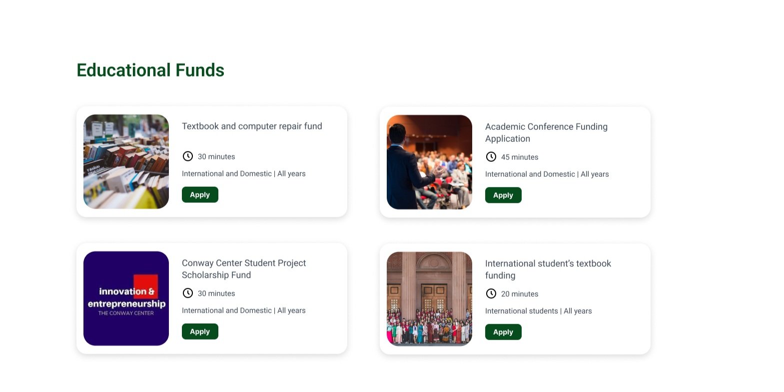
Resources Page
The resources page acts as a centralized hub, with resources categorized by type—academic support, living expenses, emergency funding, and more. Each resource card includes key details like estimated processing time, success rate, eligibility, and student-submitted tips. Students can also like, save, and share resources, creating a more interactive and community-driven experience.
News & Updates Page
This section keeps students informed about the latest funding opportunities, events, and announcements from the AEC. It ensures students stay up to date with the evolving support landscape on campus.
FAQ Page
Organized into helpful sections, the FAQ page addresses the most common questions students have about funding, eligibility, and application steps. It’s designed to reduce confusion, encourage self-guided discovery, and save students time.
Future Goals
Collaboration amplifies design: Feedback from my teammates helped me uncover blind spots and make better decisions throughout the process.
Iteration is key: I learned to let go of ideas that weren’t working and pivot quickly based on research and usability insights.
Design is never done: Even after testing, I found new ways to improve the experience—especially around clarity and trust in the application process.
We tested the final prototype with 10 students, all of whom expressed excitement and relief at finally seeing resources centralized in one place.
"Wow, I didn’t even know Smith had all these resources available. I’m definitely going to be using this all year round!" – Smith student
This feedback validated that our design not only solved a real problem, but also built trust and awareness among students.
Launch and collaborate: I aim to work with the AEC and development team to bring the platform to life.
Smarter resource matching: I envision building an automated system that suggests funding opportunities based on student profiles—making access even more personalized and efficient.
Revisiting pain points
06
Students struggled to locate all available resources across different pages and platforms.
✅ Solution: The Resources Page acts as a centralized hub, clearly categorizing funding options (academic, living expenses, emergency, etc.). A consistent layout and smart filtering make it easier to find relevant opportunities without getting overwhelmed.
Many students hesitated to apply because they didn’t understand eligibility or what documents were required.
✅ Solution: Each resource card displays key information at a glance, including eligibility tags, processing time, and success rates, with FAQ sections and a tips/comments feature where peers can share their experiences and advice.
Students often felt alone in the process of applying for resources and navigating support options.
✅ Solution: The Connect Page and comment sections on each resource allow students to interact, support one another, and share insights, creating a stronger sense of community and trust around the funding process.